Styling and Customizing Material UI Date Pickers


With the Material-UI (MUI) library and its latest version, MUI v6, you can easily incorporate stylish and customizable Date Pickers into your React applications. MUI v6, built on top of the Material Design system, offers a comprehensive set of components and styling options. This article will show you many options for styling and customizing date pickers, so you can get the exact result you want.

Discover how at OpenReplay.com.
Date Pickers are essential components in web development for selecting dates efficiently and providing a user-friendly experience. mui/material-ui-pickers used to be the standard library for integrating Date Pickers into React applications using the Material UI standard. Unfortunately, the material-ui-pickers repository has been archived because Material-UI no longer supports it.
In this guide, we will explore how to style and customize MUI v6 React Date Pickers to match your application’s design requirements. We’ll cover the basic styling of MUI v6 react date pickers, migrating from @material-ui/pickers, advanced styling techniques handling date picker events/validation, customizing date formats/localization, and applying them to the date picker component. By the end, you’ll have the knowledge and tools to tailor the appearance and behavior of your Date Pickers according to your project’s needs.
Whether you want to change the colors, adjust the layout, or modify specific elements of the Date Picker, this guide will provide you with the steps to achieve a personalized and visually appealing result.
Why would you use this library?
Developers often ask, “What makes mui/material-ui-pickers special among the many available date pickers?” It’s a valid question considering the abundance of options out there. However, there are compelling reasons why mui/material-ui-pickers stands out. First and foremost, mui/material-ui-pickers seamlessly integrates with Material-UI, a highly popular and widely adopted styling and UI component library for React applications. Material-UI has gained immense popularity in both frontend web and mobile development ecosystems. By aligning with Material Design guidelines, mui/material-ui-pickers ensure that the date pickers, time pickers, and datetime pickers provided maintain a consistent look and feel within your application. What sets mui/material-ui-pickers apart is the fact that it is developed by the Material-UI team itself. Material-UI is trusted and used by renowned companies such as Spotify, Amazon, Netflix, and Unity to deliver exceptional experiences for developers and users. By leveraging a date picker that seamlessly integrates with Material-UI and is built by the same team, you can be confident in its quality, reliability, and adherence to best practices.
Possible disadvantages of MUI v6 React Date Pickers
The major disadvantage with the latest Material-UI (v6) version is the difficulty with styling/customization using its official documentation, few resources on styling/customizing date-pickers, and many unanswered Stackoverflow questions regarding that topic.
Installation
Using your favorite package manager, you can install @mui/x-date-pickers for the free community version or @mui/x-date-pickers-pro for the commercial version and the date library to manipulate the date.
npm install @mui/x-date-pickers
# Install date library (if not already installed)
npm install date-fns
@mui/x-date-pickers supports various date libraries. If you need more information about these date libraries, take a look at the dedicated section
The Date and Time Pickers package has a peer dependency on @mui/material. If you are not already using it in your project, you can install it with the following:
# with npm
npm install @mui/material @emotion/react @emotion/styled
# with yarn
yarn add @mui/material @emotion/react @emotion/styled
Setup your date library adapter
To properly render components, it’s essential to have a LocalizationProvider higher up in the React component tree. The LocalizationProvider component serves as a container that receives the adapter from your chosen date library (for example, AdapterDayjs based on dayjs) and makes it accessible to all Date and Time Pickers components through React’s context system.
In the documentation, you might notice that each demonstration has its own LocalizationProvider wrapper. However, it’s important to note that this is not a pattern to be replicated in your code. The purpose of having separate LocalizationProvider instances is to maintain atomic and functional examples, especially when running them in a platform like CodeSandbox.
The recommended approach is to declare the LocalizationProvider once, wrapping your entire application. This way, you won’t need to repeat the boilerplate code for every Date and Time Picker component in your application. By placing the LocalizationProvider at a higher level, you ensure that all Date and Time Pickers within your app can access the necessary localization data without additional configuration.
import React from "react";
import ReactDOM from "react-dom";
import { AdapterDateFns } from "@mui/x-date-pickers/AdapterDateFns";
import { LocalizationProvider } from "@mui/x-date-pickers/LocalizationProvider";
import "./index.css";
import App from "./App";
ReactDOM.render(
 <React.StrictMode>
  <LocalizationProvider dateAdapter={AdapterDateFns}>
   <App />
  </LocalizationProvider>
 </React.StrictMode>,
 document.getElementById("root"),
);
Render your first component
To make sure that everything is set up correctly, try rendering a simple DatePicker component:
import { MobileDatePicker } from "@mui/x-date-pickers/MobileDatePicker";
function App() {
 return (
  <div className="w-80 border p-6 h-[400px] m-8">
   <MobileDatePicker />
  </div>
 );
}
export default App;
Migrating from `@material-ui/pickers“
To migrate from `@material-ui/pickers“ to @mui/x-date-pickers, you need to install the @mui/x-date-pickers package if it’s not already installed.
# with npm
npm install @mui/x-date-pickers
Before:
import { KeyboardDatePicker } from '@material-ui/pickers';
<KeyboardDatePicker />
After:
import DatePicker from '@mui/x-date-pickers';
<DatePicker />
The MuiPickersUtilsProvider was removed in favor of LocalizationProvider. Also, pickers do not require you to install date-io adapters manually. Everything is included with the `@mui/x-date-pickers“.
Before:
import AdapterDateFns from '@date-io/date-fns';
import { MuiPickersUtilsProvider } from '@material-ui/pickers';
function App() {
 return (
  <MuiPickersUtilsProvider dateAdapter={AdapterDateFns}>
   ...
  </MuiPickersUtilsProvider>
 )
);
After:
import AdapterDateFns from '@mui/x-date-pickers/AdapterDateFns';
import LocalizationProvider from '@mui/x-date-pickers/LocalizationProvider';
function App() {
 return (
  <LocalizationProvider dateAdapter={AdapterDateFns}>
   ...
  </LocalizationProvider>
 )
);
Let’s dive into the process of styling and customization for MUI v6 React Date Pickers and unlock the potential to enhance the user experience of your applications.
Basic Styling of MUI v6 React Date Pickers
The basic Styling of MUI v6 React Date Pickers involves inspecting the HTML elements of the date picker component in the browser, followed by copying the class name that we want to modify its style and then modifying the class name in our project’s css file.
Let’s customize the styling of our date picker calendar component:
Inspect the toolbar section of the date picker calendar in the browser, as seen in the image below
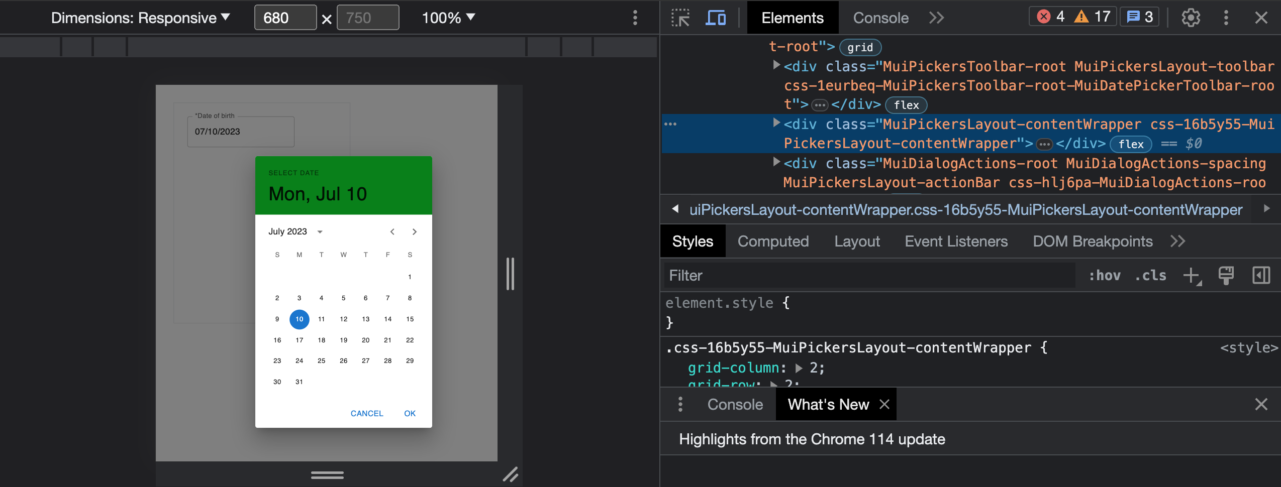
Next, copy the class name with the css prefix, head over to the index.css file, and modify its styles as follows:
.css-1eurbeq-MuiPickersToolbar-root-MuiDatePickerToolbar-root {
 background-color: green;
}
Now, the toolbar’s background color is customized with a green color. We can apply a similar approach in customizing any element in the date picker.
Everything works fine, but the downside to this approach is that the styles get lost each time a new build is generated for our project. This happens because the class name prefix css-1eurbeq changes for each build version. So, we need something different!
Advanced Styling Techniques
To apply the advanced Styling Techniques, we need to understand the default layout structure of MUI v6 React Date Pickers. By default, pickers are made of 5 subcomponents present in the following order:
- The toolbar displays the selected date (section with the red border).
- The shortcuts allow quick selection of some values. It can be added with slotProps.shortcuts
- The content (section with the green border) displaying the current view. It can be a calendar or a clock.
- The tabs allow switching between day and time views in Date Time Pickers. It can be enforced with the
slotProps: { tabs: { hidden: false } }prop. - The action bar (section with the blue border) allows some interactions. It can be added with
slotProps.actionBarprop.
By default, the content and tabs are wrapped in a contentWrapper to simplify the layout. You can customize those components individually by using slots and slotProps.
Adding an icon to the picker date input field
We can add an icon to the picker date input field using the input and adornment props and style it as follows
<MobileDatePicker
 label="*Date of birth"
 slotProps={{
  textField: {
   InputProps: {
    endAdornment: (
     <InputAdornment
      sx={{
       color: "#979797",
      }}
      position="end"
     >
      <CalendarIcon />
     </InputAdornment>
    ),
   },
  },
 }}
/>;
Customizing the style of the picker Input component
<MobileDatePicker
 label="*Date of birth"
 disableUnderline
 sx={{
  width: "100%",
  "& .MuiInputLabel-root.Mui-focused": { color: "#979797" }, //styles the label
  "& .MuiOutlinedInput-root": {
   "&:hover > fieldset": { borderColor: "#C7C8CD" },
   height: "48px",
   borderRadius: "6px",
  },
 }}
/>;
The above snippet renders a date picker input field with specific styling and properties as follows:
disableUnderline: This attribute disables the underline styling for the input field, removing the default bottom border.sx: This is a custom styling object using the Material-UI’s styling system (SX prop). It defines various CSS styles for the component.width: “100%”: This sets the component’s width to 100%, spanning the entire available width."& .MuiInputLabel-root.Mui-focused":{ color: "#979797" }: This targets the label element when it is focused and sets its color to “#979797”, a specific shade of gray."& .MuiOutlinedInput-root": This targets the root element of the outlined input."&:hover > fieldset":{ borderColor: "#C7C8CD" }This targets the fieldset element inside the input and sets its border color to “#C7C8CD” when hovering over the input.
Customizing Picker Calendar Layout structure
Now that we know the subcomponents present in a picker, Customizing Picker Calendar Layout will be easier to understand.
const [value, setValue] = useState(new Date());
const [showCalendar, setShowCalendar] = useState(true);
const customizedDate = useRef(value);
function MyCustomLayout(props) {
 const [, setNewDate] = useState(value);
 const { toolbar, content, actionBar } = usePickerLayout(props);
 return (
  <PickersLayoutRoot
   className={pickersLayoutClasses.root}
   ownerState={props}
   sx={{
    [`.${pickersLayoutClasses.toolbar}`]: {
     color: "white",
     backgroundColor: "#F95D44",
     "& .MuiTypography-root ": {
      color: "white",
     },
    },
    [`.${pickersLayoutClasses.actionBar}`]: {
     "& .MuiButton-text ": {
      color: "#F95D44",
     },
    },
    [`.${pickersLayoutClasses.contentWrapper}`]: {
     "& .Mui-selected": {
      backgroundColor: "#F95D44",
      color: "white",
     },
     "& .Mui-selected:hover": {
      backgroundColor: "#F95D44",
      color: "white",
     },
     "& .Mui-selected:focus": {
      backgroundColor: "#F95D44",
      color: "white",
     },
    },
   }}
  >
   {toolbar}
   <PickersLayoutContentWrapper
    className={pickersLayoutClasses.contentWrapper}
   >
    {showCalendar ? (
     content
    ) : (
     <DateField
      value={value}
      autoFocus
      onChange={(e) => {
       setNewDate(e);
       customizedDate.current = e;
      }}
      variant="standard"
      label="Enter date"
      sx={{
       mx: 4,
       mt: 4,
       width: "150px",
       minWidth: "100%",
       "& .MuiInputLabel-root.Mui-focused": { color: "#F95D44" }, //styles the label
       "& .MuiInput-underline:after": {
        borderBottomColor: "#F95D44",
       },
      }}
     />
    )}
   </PickersLayoutContentWrapper>
   {actionBar}
  </PickersLayoutRoot>
 );
}
Here, we initialize a state variable setNewDate using the useState hook to store the selected date value. We use the usePickerLayout hook to retrieve the toolbar, tabs, content, and actionBar elements from the provided props. The <PickersLayoutRoot> component wraps all the subcomponents to provide the structure. By default, it renders a div with display: grid, so all subcomponents are placed in a 3x3 CSS grid.
Here’s a detailed breakdown of the code:
- The
ownerState={props}attribute sets the ownerState prop of the PickersLayoutRoot component to the provided props. - The
sxprop is a custom styling object using the Material-UI’s styling system that defines various CSS styles for different components within the layout. [.${pickersLayoutClasses.toolbar}]targets the toolbar component and applies styling to it.& .MuiTypography-roottargets the typography elements within the toolbar and sets their color to white.[.${pickersLayoutClasses.actionBar}]targets the actionBar component and applies styling to it.& .MuiButton-texttargets the text elements within the actionBar component and sets their color to “#F95D44”.[.${pickersLayoutClasses.contentWrapper}]: This targets the contentWrapper component and applies styling to it.& .Mui-selected:This targets the selected items within the contentWrapper and sets their background color to “#F95D44” and text color to white.& .Mui-selected:hover:This targets the selected items within the contentWrapper when hovered and applies the same background and text color styling.& .Mui-selected:focus:This targets the selected items within the contentWrapper when focused and applies the same background and text color styling.{toolbar}:This renders the toolbar component within the PickersLayoutRoot.{content}:This renders the content component within the PickersLayoutContentWrapper.<PickersLayoutContentWrapper>: This component represents the content wrapper within the layout.{actionBar}:This renders the actionBar component within the PickersLayoutRoot.
{
 showCalendar ? content : <DateField />;
}
This conditional statement checks if showCalendar is true. If true, it renders the content component within the content wrapper. Otherwise, it renders a custom DateField component with various props and styles.
Now, you can override the default layout elements of the component with MyCustomLayout component using the slots prop as follows:
<MobileDatePicker
 label="*Date of birth"
 disableUnderline
 slots={{
  layout: MyCustomLayout,
 }}
/>;
Customizing Picker Calendar Toolbar
function CustomToolbar(props) {
 return (
  <Box
   // Pass the className to the root element to get the correct layout
   className={props.className}
   sx={{
    display: "flex",
    alignItems: "center",
    justifyContent: "space-between",
   }}
  >
   <DatePickerToolbar {...props} />
   {showCalendar ? (
    <EditIcon
     onClick={() => setShowCalendar(false)}
     fontSize="large"
     sx={{ mr: 3, mt: 3 }}
    />
   ) : (
    <CalendarTodayIcon
     onClick={() => setShowCalendar(true)}
     fontSize="large"
     sx={{ mr: 3, mt: 3 }}
    />
   )}
  </Box>
 );
}
This code defines a custom toolbar component for a date picker, allowing for flexible styling and toggling between different views of the date picker based on the showCalendar condition.
{
 showCalendar ? <EditIcon .../> : <CalendarTodayIcon .../>;
}
This conditional statement checks if the showCalendar variable is true. If true, it renders an EditIcon component; otherwise, it renders a CalendarTodayIcon component. These icons are used as buttons to toggle between different views of the date picker.
Customizing Picker Calendar ActionBar
Let’s customize the action bar.
function CustomActionBar(props) {
 const { onAccept, onClear, onCancel, actions, className } = props;
 const localeText = useLocaleText();
 if (actions == null || actions.length === 0) {
  return null;
 }
 const menuItems = actions?.map((actionType) => {
  switch (actionType) {
   case "clear":
    return (
     <MenuItem
      data-mui-test="clear-action-button"
      onClick={() => {
       onClear();
      }}
      key={actionType}
     >
      {localeText.clearButtonLabel}
     </MenuItem>
    );
   case "cancel":
    return (
     <MenuItem
      onClick={() => {
       onCancel();
      }}
      key={actionType}
     >
      {localeText.cancelButtonLabel}
     </MenuItem>
    );
   case "accept":
    return (
     <MenuItem
      onClick={() => {
       callback(customizedDate.current);
       onAccept();
      }}
      key={actionType}
     >
      {localeText.okButtonLabel}
     </MenuItem>
    );
   default:
    return null;
  }
 });
 return (
  <DialogActions className={className}>
   <Button>{menuItems}</Button>
  </DialogActions>
 );
}
This code defines a custom action bar component for a date picker, allowing for dynamic rendering of action buttons based on the provided actions prop and executing the corresponding functions when the buttons are clicked.
Now, you can override the default ActionBar and Toolbar of the component with CustomToolbar and CustomActionBar components using the slots prop. Also, you can set the action type of the buttons in the ActionBar as follows:
<MobileDatePicker
 label="*Date of birth"
 disableUnderline
 slots={{
  layout: MyCustomLayout,
  toolbar: CustomToolbar,
  actionBar: CustomActionBar,
 }}
 slotProps={{
  actionBar: {
   actions: ["cancel", "accept"],
  },
 }}
/>;
Now, your customized date picker component should look similar to this:
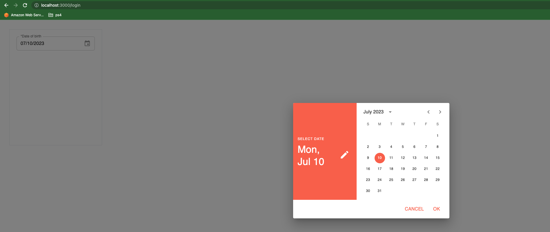
Or:
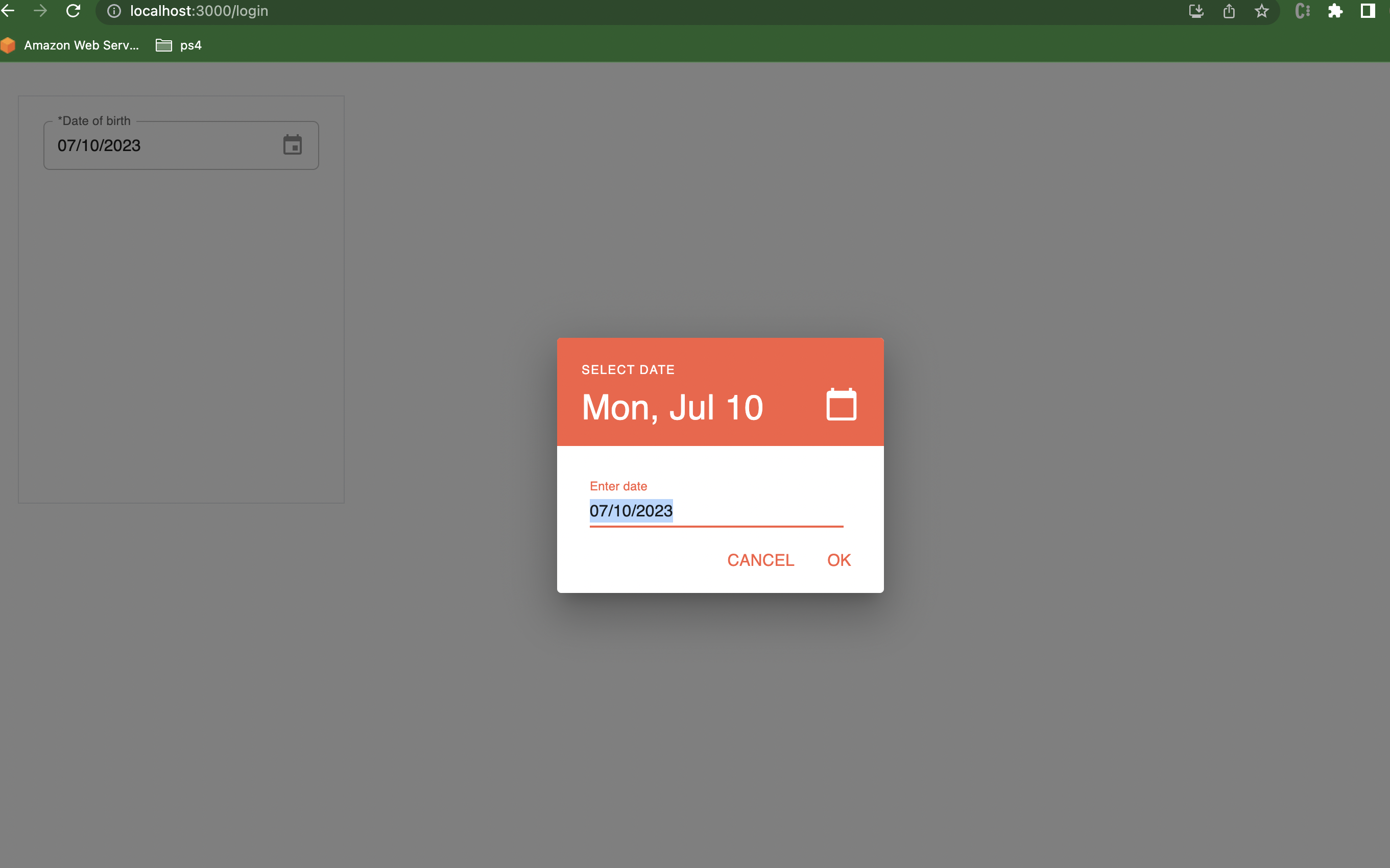 Or also:
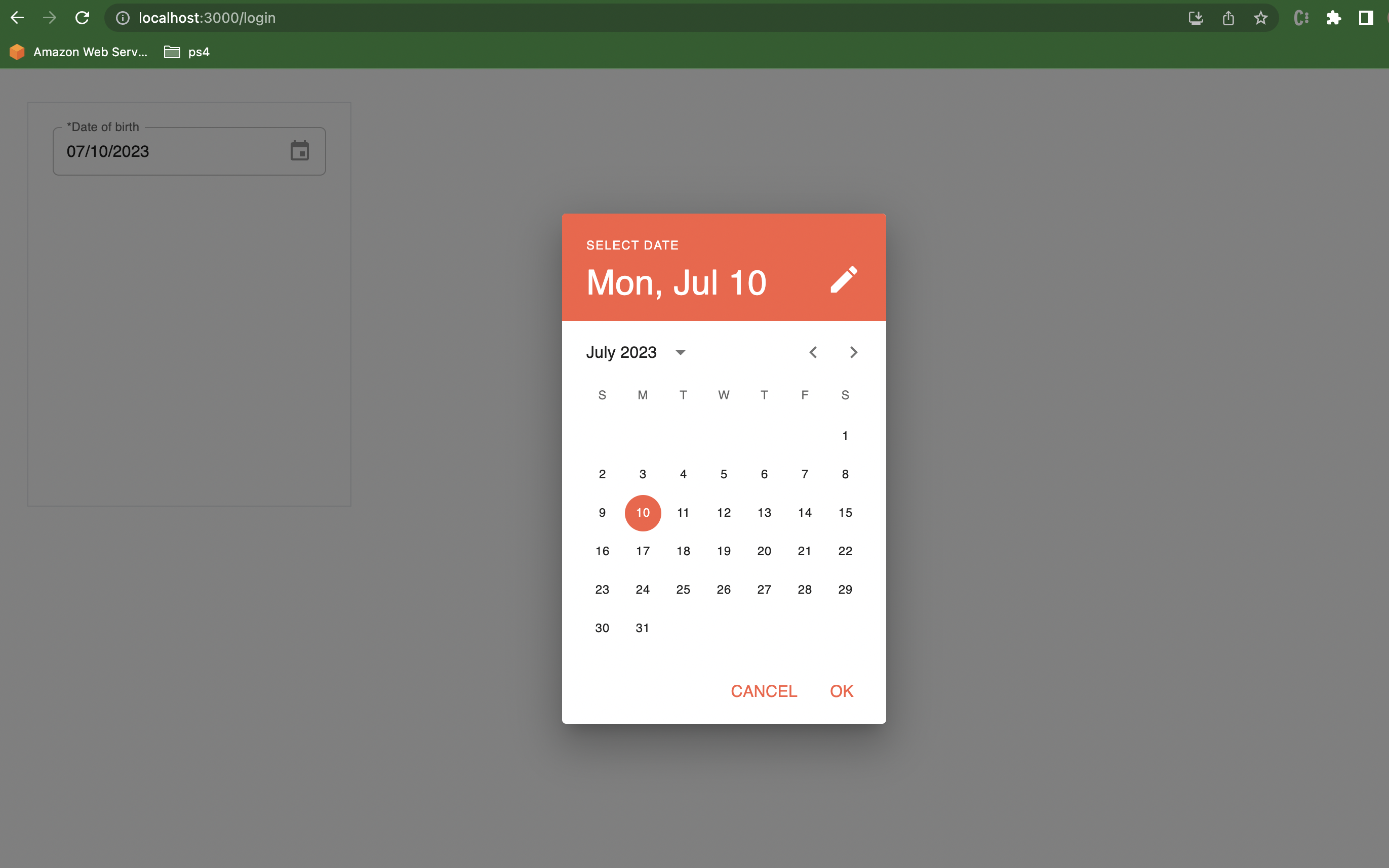
Handling Date Picker Events
Handling Date Picker Events is pretty easy and straightforward. By passing the value and onChange attribute to the picker, you can handle the picker events.
<MobileDatePicker
 className="MyDatePicker"
 label="*Date of birth"
 disableUnderline
 value={value}
 onChange={handleInputChange}
/>;
Handling Date Picker Validation
The date and time pickers typically offer an API to add validation constraints to ensure the selected value meets certain criteria. These constraints can include requirements such as minimum or maximum dates, disabled dates, specific formats, and more. When a validation constraint is applied to a date or time picker component, it automatically provides visual feedback to the user if the selected value doesn’t meet the specified criteria. This feedback can be in the form of error messages, visual indicators, or other UI cues, depending on the implementation and styling of the component. By utilizing the validation API, you can enhance the user experience by guiding them to select valid dates or times and preventing them from entering incorrect or out-of-range values. This helps maintain data integrity and improves the overall usability of your application’s date and time picker components. The following are relevant props:
-
disablePast:This prop prevents the selection of past values in date and time pickers. For date pickers, it restricts selection before the current date, while for time pickers, it restricts selection before the current time. In date-time pickers, it combines both restrictions. It ensures a more intuitive user experience by preventing the selection of outdated values. -
disableFuture:This prop prevents the selection of future values in date and time pickers. For date pickers, it restricts selection after the current date, while for time pickers, it restricts selection after the current time. In date-time pickers, it combines both restrictions. It ensures that users can only choose dates and times up to the present moment. -
shouldDisableDate:This prop allows for custom logic to prevent the selection of specific dates by returning true for those dates.
See the documentation for a complete reference to all the validation props available to the date picker components and their usage examples.
Configuring date range selection and disabling specific dates
In DateRangePicker components, the shouldDisableDate prop accepts a second argument to differentiate between the start and end dates.
For example, in the code snippet below, the start date cannot be on a weekend, while the end date is allowed to be on a weekend.
import * as React from "react";
import dayjs from "dayjs";
import { AdapterDayjs } from "@mui/x-date-pickers/AdapterDayjs";
import { LocalizationProvider } from "@mui/x-date-pickers/LocalizationProvider";
import { DateRangePicker } from "@mui/x-date-pickers-pro/DateRangePicker";
const lastSunday = dayjs().startOf("week").subtract(1, "day");
const nextSunday = dayjs().endOf("week").startOf("day");
const isWeekend = (date) => {
 const day = date.day();
 return day === 0 || day === 6;
};
export default function DateRangeValidationShouldDisableDate() {
 return (
  <LocalizationProvider dateAdapter={AdapterDayjs}>
   <DateRangePicker
    defaultValue={[lastSunday, nextSunday]}
    shouldDisableDate={(date, position) => {
     if (position === "end") {
      return false;
     }
     return isWeekend(date);
    }}
   />
  </LocalizationProvider>
 );
}
Error Handling
To display the current error, you can utilize the onError callback, which is triggered whenever the error changes. You can subscribe to this callback and update the helperText prop of the TextField component to show the error message. Here is an example:
import * as React from "react";
import dayjs from "dayjs";
import Box from "@mui/material/Box";
import { LocalizationProvider } from "@mui/x-date-pickers/LocalizationProvider";
import { DatePicker } from "@mui/x-date-pickers/DatePicker";
import { AdapterDayjs } from "@mui/x-date-pickers/AdapterDayjs";
const startOfQ12022 = dayjs("2022-01-01T00:00:00.000");
const endOfQ12022 = dayjs("2022-03-31T23:59:59.999");
export default function RenderErrorUnderField() {
 const [error, setError] = React.useState(null);
 const errorMessage = React.useMemo(() => {
  switch (error) {
   case "maxDate":
   case "minDate": {
    return "Please select a date in the first quarter of 2022";
   }
   case "invalidDate": {
    return "Your date is not valid";
   }
   default: {
    return "";
   }
  }
 }, [error]);
 return (
  <LocalizationProvider dateAdapter={AdapterDayjs}>
   <Box width={300}>
    <DatePicker
     defaultValue={dayjs("2022-07-17")}
     onError={(newError) => setError(newError)}
     slotProps={{
      textField: {
       helperText: errorMessage,
      },
     }}
     minDate={startOfQ12022}
     maxDate={endOfQ12022}
    />
   </Box>
  </LocalizationProvider>
 );
}
The RenderErrorUnderField component sets up a date picker with validation constraints for the first quarter of 2022.
Customizing Date Formats and Localization
The Date and Time Pickers feature within MUI offers the flexibility to accommodate formats from diverse locales. By default, MUI adopts the English (United States) locale as its standard setting. However, suppose you desire to incorporate alternative locales into your implementation. In that case, this section will enable you to seamlessly configure the Date and Time Pickers to adhere to the desired locale, ensuring a more personalized and localized experience for your users.
For dayjs, import the locale and then pass its name to LocalizationProvider as follows:
import { AdapterDayjs } from "@mui/x-date-pickers/AdapterDayjs";
import "dayjs/locale/de";
<LocalizationProvider dateAdapter={AdapterDayjs} adapterLocale="de">
 {children}
</LocalizationProvider>;
For date-fns, import the locale and pass it to LocalizationProvider :
import { AdapterDateFns } from '@mui/x-date-pickers/AdapterDateFns';
import de from 'date-fns/locale/de';
<LocalizationProvider dateAdapter={AdapterDateFns} adapterLocale={de}>
 {children}
</LocalizationProvider>;
For luxon, pass the locale name to LocalizationProvider :
import { AdapterLuxon } from "@mui/x-date-pickers/AdapterLuxon";
<LocalizationProvider dateAdapter={AdapterLuxon} adapterLocale="de">
 {children}
</LocalizationProvider>;
For moment, import the locale and then pass its name to LocalizationProvider :
import { AdapterMoment } from '@mui/x-date-pickers/AdapterMoment';
import 'moment/locale/de';
<LocalizationProvider dateAdapter={AdapterMoment} adapterLocale="de">
 {children}
</LocalizationProvider>;
To explore the extensive range of locales supported by the date libraries, you can follow these steps:
- On your keyboard, press the CMD (Command) key (for Mac users) or the CTRL key (for Windows users).
- While holding down the CMD/CTRL key, click on the import statement for the date library. This action will typically be represented by a clickable link or button. By doing so, a new window or tab will open, displaying the file for the date library. In this file, you will find comprehensive information about the various locales supported by the library. You can navigate through the file to discover the specific locales available and the corresponding codes or names used to represent them. This will empower you to select and utilize the desired locale in conjunction with the date and time pickers, enhancing the localization capabilities of your application.
Customizing Date Formats
To customize the format of the Date and Time Pickers format, you can use the format prop, which is accessible on all fields and pickers within the component. By specifying the format prop, you can define the desired format for displaying and inputting dates and times. This allows you to tailor the appearance and behavior of the pickers according to your specific requirements. For example, you can utilize different combinations of symbols, such as ‘YYYY’ for the year, ‘MM’ for the month, ‘DD’ for the day, ‘HH’ for the hour, ‘mm’ for the minute, and ‘ss’ for the second. By arranging these symbols in a particular sequence and incorporating separators or other characters, you can create custom formats like ‘MM/DD/YYYY’, ‘YYYY-MM-DD HH:mm’, or ‘DD.MM.YYYY HH:mm:ss’.
<DatePicker label="Date Field" format="MM - DD - YYYY" />;
<DatePicker label="Date Field" format="MM / DD / YYYY" />;
Enabling keyboard navigation and shortcuts for quicker date selection
Keyboard navigation can be achieved using the <DateField/> or <TimeField/> component, which is designed to enable keyboard-based input of dates or times, eliminating the need for popover or modal interfaces. These fields offer enhanced user experience by facilitating smooth navigation using arrow keys and supporting advanced features such as localization and validation.
<DateField defaultValue={defaultValue} />;
<TimeField defaultValue={defaultValue} />;
<DateTimeField defaultValue={defaultValue} />;
Adding additional components, such as time pickers or date range sliders
Time Pickers
The Time Picker component incorporates various underlying components to facilitate different modes of editing and ensure a seamless user experience across different devices. It utilizes the following components:
TimeField:This component is responsible for enabling keyboard-based editing of the time value. It allows users to directly enter the desired time using their keyboards, providing a quick and efficient input method.DigitalClock:Designed for desktop view editing, the DigitalClock component offers an intuitive interface for selecting and modifying time values. Users can interact with a digital representation of the clock to adjust the hours and minutes, providing a visually appealing and user-friendly editing experience.TimeClock:The TimeClock component is specifically designed for mobile view editing. It offers a mobile-optimized interface that allows users to interact with a clock-like UI to set the desired time. Users can swipe or tap on the clock’s hands to adjust the hour and minute values, providing a seamless and intuitive editing experience on mobile devices. It’s worth noting that all the documented props of theTimeField,DigitalClock, andTimeClockcomponents can be passed to the Time Picker component. This allows you to customize the behavior, appearance, and functionality of the Time Picker by leveraging the available props from these underlying components. You can refer to the documentation for the TimeField, DigitalClock, and TimeClock components to explore the various prop options and utilize them to tailor the Time Picker according to your specific requirements.
Date Range sliders
MUI v6 React Date Pickers doesn’t support date range sliders. Instead, it offers a Date Range Picker component that combines the functionality of two underlying components to provide a comprehensive editing experience for date ranges.
MultiInputDateRangeField: Enables keyboard-based editing of date ranges. Users can enter start and end dates using the keyboard, with arrow keys for navigation.
DateRangeCalendar: Provides an interactive calendar interface for selecting and modifying date ranges. Users can navigate, click to select dates, or use predefined ranges.
import { DateRangePicker } from '@mui/x-date-pickers-pro/DateRangePicker';
<DateRangePicker localeText={{ start: 'Check-in', end: 'Check-out' }} />;
You can customize the Date Range Picker by passing props from these underlying components. Check the documentation for MultiInputDateRangeField and DateRangeCalendar for available options to meet your specific requirements.
Writing clean and maintainable code for styling and customization
When it comes to writing clean and maintainable code for styling and customization of Material-UI (MUI) version 6, there are several best practices you can follow. Here are some tips:
Create reusable styles:Instead of duplicating styles across components, create reusable styles using the styled() function or custom CSS-in-JS solutions like emotion or styled-components, which allows you to define styles using the sx prop. This helps in reducing code duplication and makes it easier to maintain and update styles across your application.Use CSS modules or CSS-in-JS libraries:CSS modules or CSS-in-JS libraries like emotion or styled-components can help you encapsulate styles and prevent global CSS clashes. They allow you to define styles locally for each component, ensuring that your styles are isolated and don’t interfere with other components.Leverage theme customization:MUI provides a powerful theming system that allows you to customize the default theme to match your application’s design. Instead of hard-coding colors, sizes, or other style values, utilize the theme object to define these values and apply them consistently across your application.Extract common styles into utility classes:Identify common styles that are used across multiple components and extract them into utility classes. This approach promotes code reusability and makes it easier to maintain styles that are shared across different components.
Clean and maintainable code is subjective and can vary based on the specific requirements and preferences of your project. However, following these best practices will generally lead to more organized and manageable styles in your MUI 6 application.
Alternatives to MUI v6 react-date-pickers and why (or why not) use them
There are several alternatives to MUI v6 React Date Pickers available, each with its own advantages and considerations. Here are a few popular alternatives and reasons to use or not use them:
React-datepicker: React-datepicker is a widely used date picker library that offers a simple and customizable UI. It provides various configuration options, including date formatting, internationalization, and different date selection modes. It is highly flexible and has good documentation and community support. However, it might require additional styling and customization to match the Material UI design system.
React-dates: React-dates is a feature-rich date picker library developed by Airbnb. It provides a highly customizable date picker with support for a single date, date range, and date range with predefined options. It includes features like date range constraints, internationalization, and flexible styling options. However, it might have a steeper learning curve due to its comprehensive feature set.
These date picker components for React are designed to be simple and reusable. However, it is worth noting that the default user interfaces and developer experience may not be as visually appealing as desired.
Conclusion
In conclusion, while the material-ui-pickers library is no longer supported, the latest version of Material-UI (MUI v6) provides robust and customizable options for incorporating Date Pickers into your React applications. With MUI v6’s extensive set of components and styling capabilities, you have the tools to create stylish and user-friendly Date Pickers that align with your application’s design requirements. This guide has explored various aspects of styling and customization for MUI v6 React Date Pickers. From basic styling to advanced techniques such as handling events and validation, customizing date formats and localization, and applying these changes to the Date Picker component, you now have a comprehensive understanding of how to tailor the appearance and behavior of Date Pickers in your project.
Truly understand users experience
See every user interaction, feel every frustration and track all hesitations with OpenReplay — the open-source digital experience platform. It can be self-hosted in minutes, giving you complete control over your customer data. . Check our GitHub repo and join the thousands of developers in our community..