Understanding the calc() function in CSS

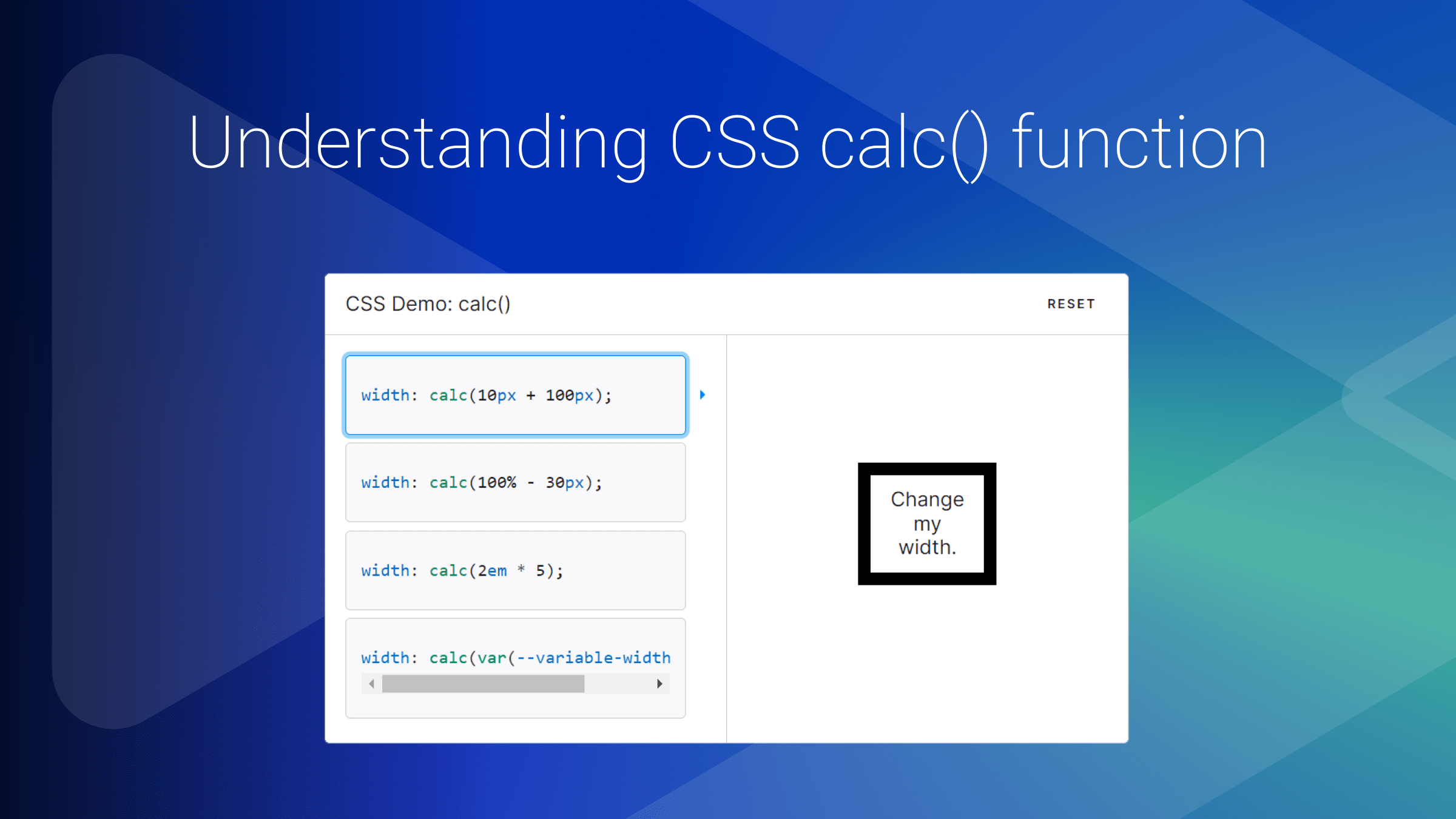
Frontend web developers often find themselves needing to write complex calculations to ensure their designs are adaptable to screen sizes of various designs. You’ve probably heard of the CSS calc() function – a powerful tool that simplifies layout calculations and enhances flexibility in styling web elements. This tutorial will dig into CSS
calcfundamentals and help you understand how it works with some examples.

Discover how at OpenReplay.com.
As web designers, we’re constantly tasked with crafting layouts that look great and function flawlessly across a wide range of devices. From desktop monitors to smartphones and everything in between, the demand for flexibility often leads to intricate calculations to determine dimensions, margins, and positioning. Traditional CSS properties like percentages and fixed values can only take designers so far in achieving truly accurate and responsive designs. This is where the calc function comes into play.
Introducing the calc() Function
So, what exactly is CSS calc, and why should you care? Simply put, calc lets us perform mathematical calculations within our CSS stylesheets. Need to dynamically adjust the width of an element based on the viewport size? calc has got you covered. Want to calculate the perfect font size for optimal readability? calc can help with that, too. The CSS calc function can be used in calculating percentage, length, time, numbers, integers, frequencies, etc.
Here is the syntax:
property: calc(expression);
/* property: calc(expression) */
width: calc(100vw - 50px);
From the code snippet above, the value of width is calculated by calculating the expression 100vw - 50px. The expression is used as the calc function parameter, and the result of subtracting 50px from 100vw is used as the value for width.
To write these kinds of expressions, we can use the operators listed below:
- Addition: It adds two or more operands to the function expression.
height: calc(100px + 2px)- Subtraction: It subtracts the second operand from the first in the function expression.
height: calc(100px - 2px)- Multiplication: It multiplies the specified operands.
height: calc(50vh * 2)- Division: Divides the left-side operand (dividend) by the right-side operand (divisor).
height: calc(200vh / 2)Rules when using the Math operators
In this article section, we’ll learn some rules to follow when using the calc() function. Here are some of the rules:
- Addition (+) and subtraction (-) require both numbers to be length:
.class {
  /* Valid */
  margin: calc(5px + 10px);

  /* Invalid */
  margin: calc(5px + 10);
}- When using multiplication, one of the numbers should be unitless:
.class {
  /* Valid */
  margin: calc(10px * 2);

  /* Invalid */
  margin: calc(10px * 2px);
}- When using a division operator, the second number should be unitless:
.class {
  /* Valid */
  margin: calc(10px / 2);

  /* Invalid */
  margin: calc(10px / 2px);
}- When using the
calc()function, you cannot substitute the numeric value for percentage types:
.class {
  /* Valid */
  margin: calc(100% / 4);
  /* Invalid */
  margin: calc(100 / 4) %;
}- The use of whitespace when doing addition and subtraction matters:
.el {
  /* Valid */
  width: calc(100vw + 2px);

  /* Invalid */
  width: calc(100vw+2px);

  /* Valid */
  width: calc(100vw - 2px);

  /* Invalid */
  width: calc(100vw-2px);
}
When it comes to multiplication and division in CSS’s calc() syntax, you don’t necessarily need to put spaces around the operators for the code to work. But throwing in spaces anyway is a smart move—it makes your code easier to read and keeps things consistent with how you handle other operators that do need the space.
.class {
  /* This is totally fine! */
  width: calc(100vw / 2);
}
What about those spaces outside the calculation? They’re not going to make or break anything. Feel free to break your lines for clearer, more approachable code. It’s all about making your stylesheet as neat as possible so it’s easier for you or anyone else to dive back in later.
In the article’s next section, we’ll discuss some use cases when using the CSS calc() function.
Let’s get started.
Responsive font sizes with CSS calc()
Responsive font sizes are important in modern web development. By blending fixed and relative units, designers can create a scalable typography system that adapts fluidly to screen changes.
Here’s an example that demonstrates how to use calc() for responsive font sizes:
body {
  font-size: calc(1rem + 5vw);
}
The calc() function above will make sure that the font size is responsive for all screens. For example, on desktop screens, the font would be adequately large and will shrink if the webpage is to be resized to a mobile screen.
This strategy is all about combining fixed and flexible units. This mix ensures that your website’s text is never too small to read on the phone or absurdly large on a desktop, maintaining that perfect balance for readability and engagement.
When
calc()is used for controlling text size, be sure that one of the values includes a relative length unit
Flexible NavBar Positioning with calc()
Let’s say we are building a portfolio website with a side navbar and a main section.

The image above shows that the side navigation bar is fixed while the main section takes up the rest of the space. Achieving this without CSS calc() might be a little bit tricky, but with the help of some calculations, we can easily implement it.
/* HTML code */
<body>
  <section>
    <nav>
      <h1>Side Nav</h1>
    </nav>
    <article>
      <h1>Main Section</h1>
    </article>
  </section>
</body>
/* CSS code */
article,
nav {
color: #05386b;
padding: 30px;
box-sizing: border-box;
font-family: Arial, Helvetica, sans-serif;
}
nav {
width: 200px;
float: left;
background: #379683;
}
article {
width: calc(100% - 200px);
float: right;
background: #5cdb95;
}So, here’s how we’ve set things up for the layout on our page: We’re using this nifty CSS trick for the Main Section where we say, “Hey, take up all the space you can, but remember to leave out 200 pixels for our Side Nav section.”
This little line of code, calc(100% - 200px), is our magic spell. It’s what makes sure the main section fills up the space just right, hugging the edge of the side nav without spilling over or leaving any awkward empty space.
It’s pretty cool because no matter how you mess with the size of your browser window, the main section and side nav just stick together like best buds— side nav stays its ground, and the main section stretches or shrinks to fit the rest of the space.
Positioning Images with calc()
This section will show you a use case of the calc() function. We’d look at two examples:
- Position an Image to the bottom of a container/page
- Illustrate full image responsiveness
To position an image to the bottom of a container, you’d need to do this:
.container {
  height: 500px;
  padding: 20px;
  box-sizing: border-box;
  background-image: url(https://png.pngtree.com/png-vector/20190330/ourmid/pngtree-vector-picture-icon-png-image_890152.jpg);
  background-position: calc(100% - 20px) calc(100% - 10px);
  background-repeat: no-repeat;
}
This code background-position: calc(100% - 20px) calc(100% - 10px); positions the background image within the container. The first value (calc(100% - 20px)) is for the horizontal position, and the second value (calc(100% - 10px)) is for the vertical position.
Here is our output:
Essentially, this moves the background image to the bottom right corner of the container but offsets it a little from the very edge—20 pixels from the right and 10 pixels from the bottom. The calc() function is used here to calculate these positions dynamically.
Illustrate full image responsiveness
Imagine we have a blog, and we don’t want our blog image to be confined to the width of the container but spread to the width of the screen, just like the image below.
To achieve this, our code should look something like this:
img{
  max-width: 100vw;
  height: 40vh;
  width: 100vw;
  margin: 0 calc(-50vw + 50%);
}
Enhancing Layouts with CSS Variables and calc()
Let’s create a dynamic grid layout that automatically adjusts the size of its items based on the container’s width, providing an example of how the CSS calc() function effectively manages spacing and alignment in a more complex scenario.
/* HTML code */
<div class="grid-container">
  <div class="grid-item">Item 1</div>
  <div class="grid-item">Item 2</div>
  <div class="grid-item">Item 3</div>
  <div class="grid-item">Item 4</div>
  <div class="grid-item">Item 5</div>
</div>
This HTML setup defines a container (grid-container) that holds five items (grid-item). Each item represents a content block within our grid.
.grid-container {
  display: grid;
  grid-template-columns: repeat(auto-fill, minmax(calc(100% / 3 - 30px), 1fr));
  gap: 15px;
  padding: 15px;
  background-color: #f0f0f0;
}

.grid-item {
  background-color: #ffffff;
  padding: 20px;
  text-align: center;
  border: 1px solid #ddd;
}
Here is the output:
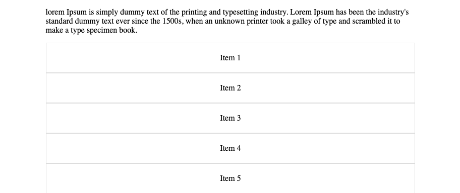
The .grid-container is styled as a grid layout. The grid-template-columns property is set to create as many columns as can fit in the container, with each column having a minimum and maximum width defined by the minmax() function. Inside minmax(), calc(100% / 3 - 30px) calculates each column’s width to be a third of the container’s width minus 30px (accounting for gaps), ensuring that each item has equal spacing.
Common Places to Use CSS calc()
The calc() function shines in several scenarios, making it a go-to solution for crafting responsive and visually appealing web designs. Let’s dive into where calc() is commonly used:
- Creating Fluid Layouts: Imagine wanting your site to look great on any screen, from a tiny phone to a wide-screen monitor.
calc()lets you mix percentages with fixed pixels to get layouts that stretch or shrink but keep certain elements just where you want them. - Scaling Text Gracefully: Combine viewport units with pixels or ems, and your fonts will grow or shrink across devices, making sure they’re always easy on the eyes.
- Smart Spacing: Whether it’s padding, margins, or gaps between items,
calc()helps ensure your spacing is dynamic and adapts to the screen, keeping your design breathable and balanced no matter the device. - Complex Grids Made Easy: For those intricate grid layouts that need to respond dynamically to content or screen size,
calc()is a lifesaver. It lets you fine-tune grid tracks and gaps for layouts that look intentional and harmonious. - Keeping Aspect Ratios Intact: Use
calc()to maintain the aspect ratio of images or video containers. This way, they’ll scale properly without distorting, ensuring your visuals look sharp across all devices.
Conclusion
We explored real-world examples, including responsive navbar positioning and full-width image responsiveness, providing tangible code snippets to illustrate calc() in action.
Also, common usage scenarios were identified, emphasizing calc()’s role in creating responsive, adaptable, and visually consistent web designs across different devices and screen sizes. Hopefully, you’ve been able to learn one or two things from this article.
Truly understand users experience
See every user interaction, feel every frustration and track all hesitations with OpenReplay — the open-source digital experience platform. It can be self-hosted in minutes, giving you complete control over your customer data. . Check our GitHub repo and join the thousands of developers in our community..